IDENTITY
|
PACKAGING
|
SOCIAL
|
WEBSITE
|
ADVERTISING
|
IDENTITY | PACKAGING | SOCIAL | WEBSITE | ADVERTISING |
ANDRETTI AUTOSPORT
Agency: Young & Laramore
Client: Andretti Autosport
Andretti Autosport was in search of a new logo to be used for their transition into Formula One racing. A sleek, simple design that would easily be recognized on the side of a building or a car zipping around the racetrack was the goal.
These two options were produced as possible identities:
Option 1
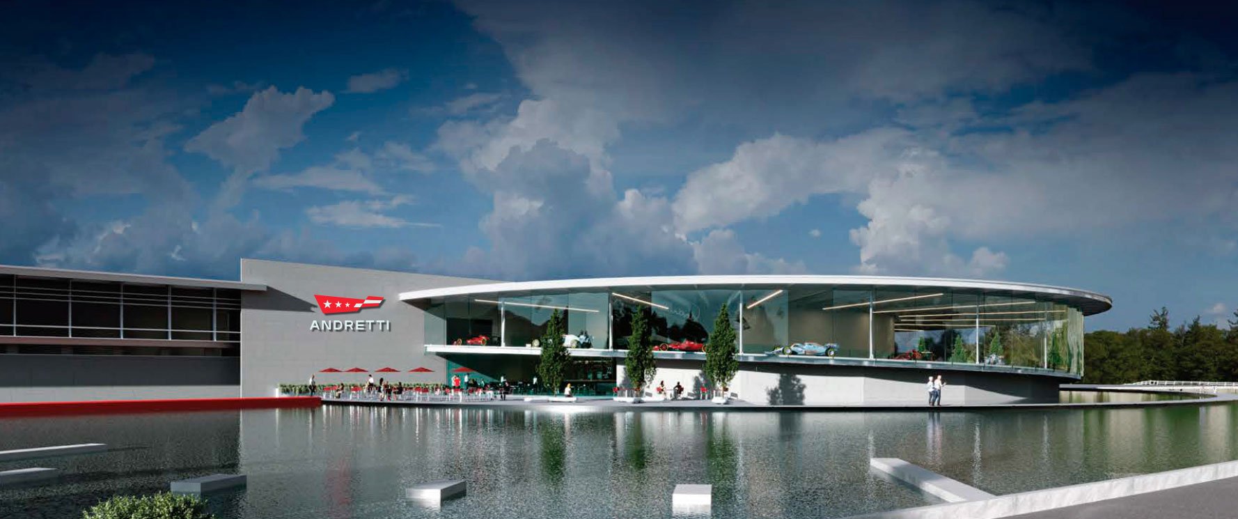
This option pulls shapes from their beloved existing logo. The 3 stars represent their 3 generations and the blowing flag represents the speed associated with the family name.
Logo shown on proposed Formula One headquarters
Option 2
This option represents the 3 generations with 3 different sized lines. These lines come together to form an A for Andretti.
Logo shown on proposed Formula One headquarters
Proposed logo options shown next to the previous logo


